Last month I wrote about rearranging my bedroom to make it serve my organizational needs better and to create the feeling of more space. After spending time hunting down extra decor pieces, painting, sewing, and further decluttering my room to rid it of absolutely everything that didn’t belong or wasn’t needed, I am happy to report that my project is finally complete!
I didn’t have the time or the money to completely redecorate. Instead, I edited my previous decorating scheme by changing up bed coverings and window treatments to tone down the color scheme, and rearranging decor items that I already owned. Even though it’s probably not something I would have come up with if I could have started completely from scratch and with a higher budget, my husband and I both love the end result.
When we first moved in almost six years ago, the walls were a very dingy white.
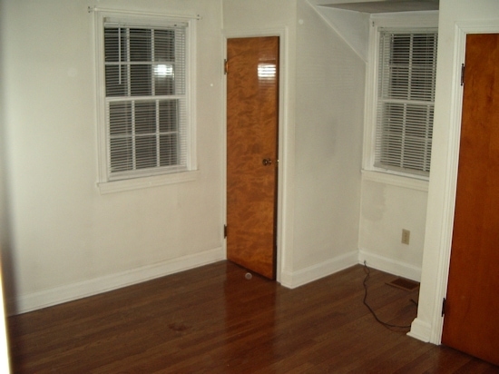
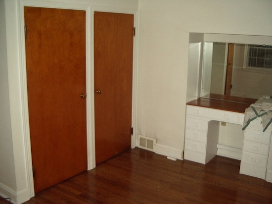
The built-in vanity was a cute idea, but not very functional or pretty. The orangey-brown closet doors (three of them along one wall) really chopped up the room.
Of course the master bedroom was one of the first design projects I wanted to tackle after we moved in. My budget didn’t really match my lofty goals inspired by the beautiful bed and breakfasts we stayed in during our honeymoon, or the pictures from Architectural Digest mansions that I cut out. Our bedroom furniture was a thrift shop find. It was a good high quality cherry set made by Heywood-Wakefield, but in a 1970’s colonial style rather than their cool art deco stuff that they are famous for. I’m not crazy about faux colonial, but it could be worse. I selected a paint color to pick up a color in the bedding set we had registered for and received as a wedding gift. I created a canopy effect with semi-matching curtains. It was nice for a little while, but eventually I realized that the contrasting colors, patterns and textures were way too busy for the small room (I don’t have a photo of the striped curtains that hung from the windows). It seemed chaotic rather than relaxing. It just wasn’t my taste.
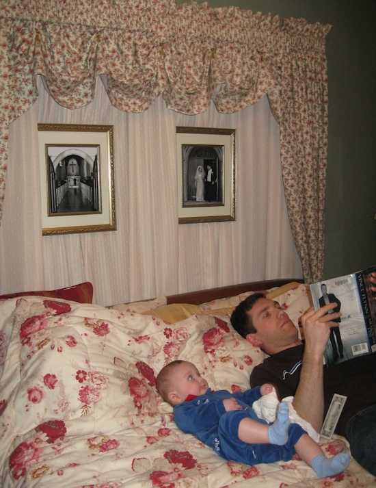
As time went on, I realized I preferred more soothing, neutral palettes. I particularly love gray and yellow together. Repainting our bedroom was a chore I didn’t want to undertake, so I decided to work with what I had. The wall color (the decidedly unromantic sounding “Grandma’s Linen” from Valspar) is a very grayish green. I could definitely bring in some yellow accents. I love my Waverly Garden Rose bedding, but the red against the green was just too much. Rather than getting rid of the high quality comforter, I purchased a duvet cover on sale. It had a French provincial design that I loved, and although the toffee color wasn’t exactly what I would have liked, it worked okay with the other colors in the room. I soon had a soothing, natural color scheme for my room: green, black, browns and pops of gold and yellow. Let’s take a look!
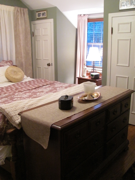
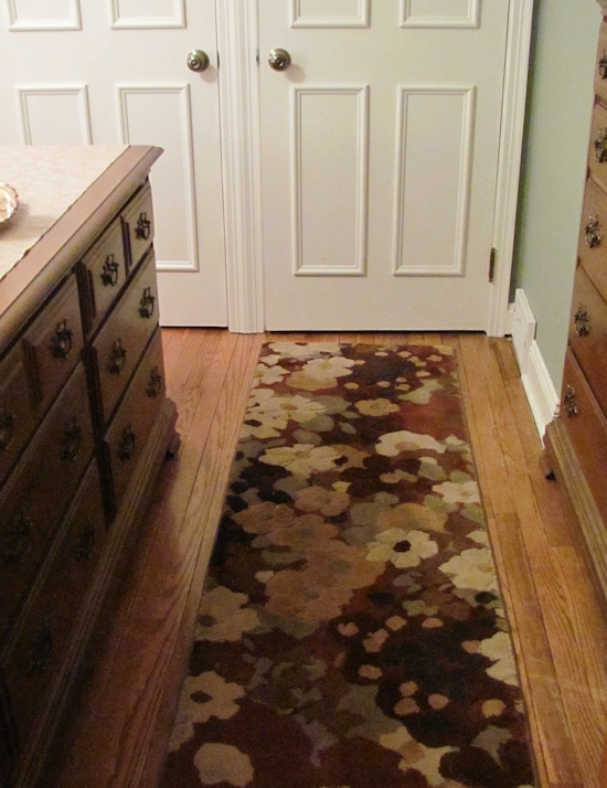
I removed the mirror from my dresser and placed the dresser at the foot of the bed. It looks and functions very well and creates a small entryway of sorts. A floral runner that I had bought on clearance a while ago fit the space perfectly (it had been too dark in the hallway where I had originally placed it–even though it was cheap, I had rather regretted the purchase until now).
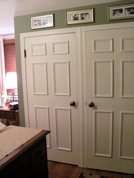
The closet doors are one of the aspects of the original design that I got right. I laid out the design for faux panels created from molding, and my patient and loving husband cut the pieces and assembled them for me. He glued the “panels” onto the original doors, then painted them the same color as the trim. We did the same in my son’s room later. Note that this is not always cheaper than simply replacing a door, but in our case the closet doors are custom sized and would be very expensive to replace with something fancier. This added a lot of character to our room! I placed framed photos from our wedding proof album in the space between the doors and the ceiling.
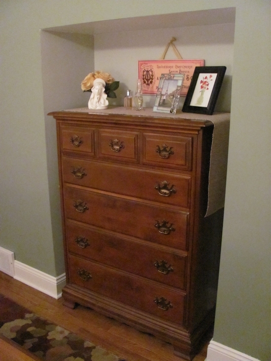
To the right is the nook left after we removed the old vanity. My husband’s dresser just happened to fit perfectly! I won the decorative French apothecary sign that hangs on the wall. A painting by my husband and a picture of us in Paris stand on the dresser. As you will see as you read on, our bedroom has a subtle international flair, inspired by our backgrounds and travels.
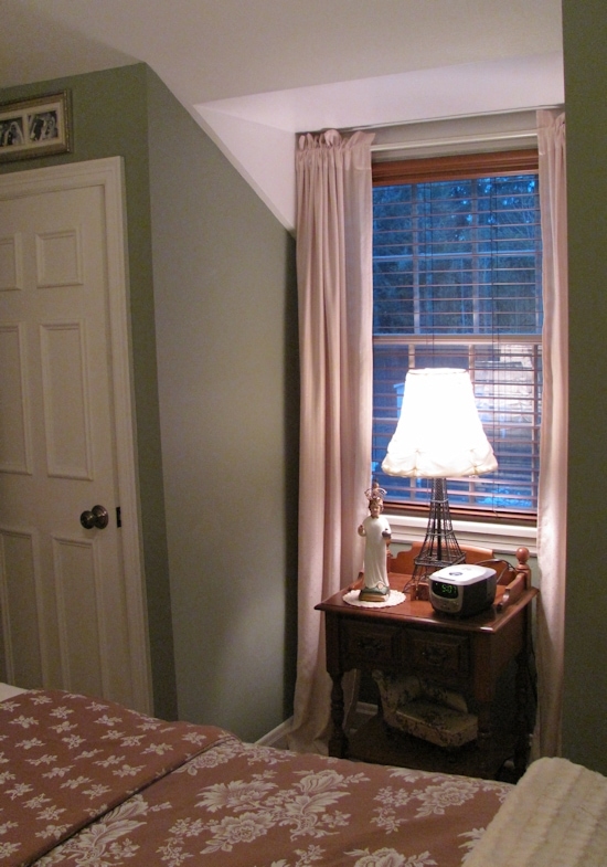
Although the new arrangement does provide room to place the bedside table beside the bed, I decided to keep it tucked away in the dormer. My sister purchased a pair of darling Eiffel Tower lamps for me as an engagement gift. My husband and I took a brief trip to Paris when I was studying abroad in England, and the lamps serve as a nice reminder of our very fun and frugal trip. We stayed in a youth hostel in Montmartre and subsisted on baguettes and pain au chocolat seated on park benches or steps of famous buildings. We became completely covered in dust walking around the Eiffel Tower (we climbed the stairs to the second level because we couldn’t afford the elevator) and the Louvre, then saw snooty sales ladies look down their noses in the kinds of stores that have one of each clothing item on the rack. I would love to go back to Paris, the most beautiful city I have visited so far!
You might remember from my previous post that I was trying to decide how to address the asymmetrical wall behind the bed. There was one window off to the side, which is partially behind the headboard. I was trying to choose between a picture frame grouping to balance out the window, or covering the whole wall with drapes. My commenters recommended the picture frame idea, but I decided to go the other way. A wall of drapery behind the bed creates the illusion of symmetry. It also works to shield us from cold winter drafts coming through the old window, and simplifies the architecture, making the room seem larger.
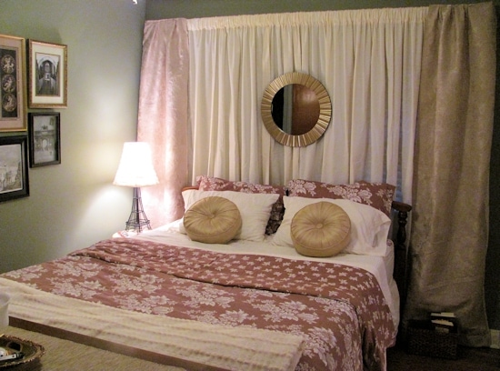
It’s very difficult to photograph this small room, but I love being inside it. I reused the curtain rod that I already owned from my previous design. The ivory curtains in the center are actually full-size sheets from Walmart, about $9 each. I only needed to snip the thread from the edges, then slip the curtain rod through the existing hem–so easy! I made the drapes on either side from upholstery fabric that I purchased quite a while ago on clearance. You can’t see it in the photo, but the pattern is almost identical to my duvet cover. I lined the drapes with a twin size sheet–a very inexpensive way to get large amounts of fabric! The sunburst mirror is from Walmart. It started out black, but that proved too stark a contrast, so I primed it and then painted with two different golds and silver. The round pillows on the bed were a bargain at $4 each on clearance at Walmart (I purchased them quite some time ago).
The small space to the left of the bed was just large enough for a small side table, a luxury I have not had until now! I adore the chinoiserie style, so I was thrilled when I found a small faux bamboo table on eBay for about $27 shipped. I added a new round table top to replace the weathered and dented brass plate that had been there before (I think the table was actually a plant stand). After much indecision, I decided to paint the whole thing in my yellow accent color. I’m glad I did–it’s a nice little surprise in the otherwise neutral room.
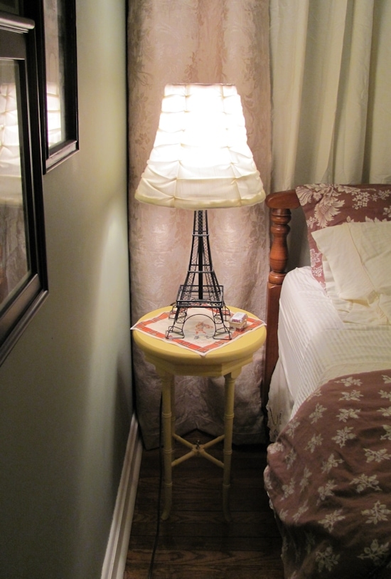
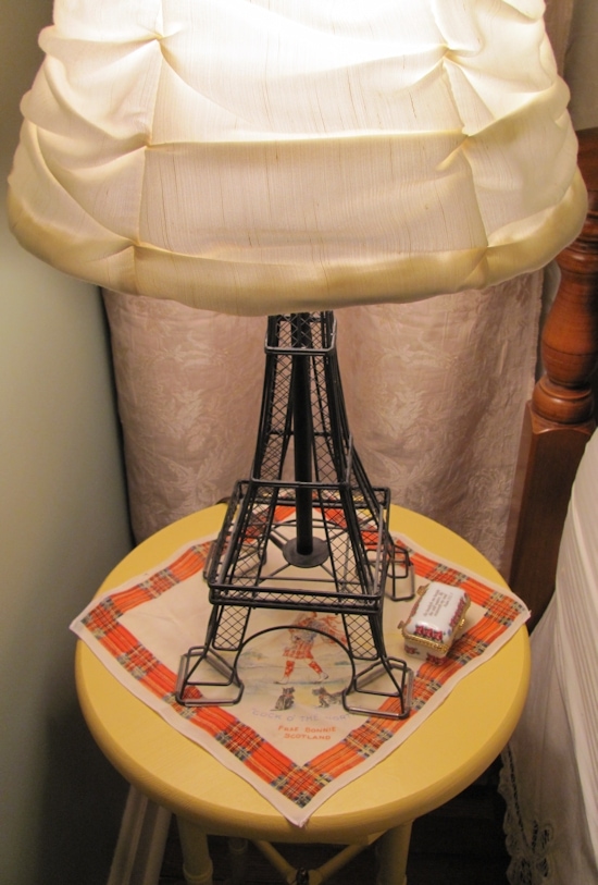
I used a cute Scotland themed silk handkerchief given to me by my mother-in-law (it belonged to her mother), as a quirky little tablecloth. It reminds me of my son, our wonderful wedding reception held at the Brae Loch Inn, our trip to Scotland in 2007 and of course my husband’s grandmother who was a one-of-a-kind character. I love it when decor has special meaning.
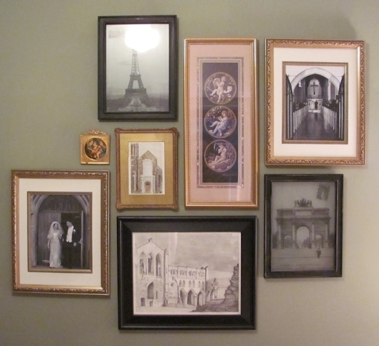
Moving the bed to a different wall meant that I had a lot of blank space where it used to be. I once again used my gallery wall idea to create a grouping of pictures, most of which had already been in my room before. It includes favorite photos from my wedding, some vintage images of Paris, a painting of the church we were married in that was done by my grandfather as a wedding gift, and my own pencil drawing of the Rievaulx Abbey ruins (I enjoy visiting ruined cathedrals, and wish I could have been married in one!). I love the mix of black, gold and cream against the green wall.
So, there you have it! It may not be exactly what I would have done had I not been limited in funds and choice, but I absolutely love my new room. It has been a soothing retreat for my husband and me, and thanks to my hours spent organizing, it is very easy to keep neat and tidy. It finally feels like a master bedroom that we deserve.

It looks Great Jenn! You have no inspired me to re-do my bedroom 🙂
Thank you Lauren! Have fun with yours!
Wow hun, this looks great. it’s amazing. I really like what you did here. Very Impressive. :0) Thanks for sharing this with us.
Thank you!
It all looks wonderful! I’m still inspired by your door re-do, I can’t wait until I have the time to get that project done in our partially finished basement doors. The curtains look great behind the bed! I love all your personal accents that look beautiful too, it’s so important in a master bedroom!
Thank you Sophie!
This is amazing, Jen! I love the before and after pictures. You are amazing. I love the new doors. By looking at them, I thought you had them replaced. I couldn’t believe it when I saw that you and your husband actually redesigned them. I love the new wall color, and the white trim and doors look crisply tailored.
You did a fantastic job of creating a beautiful and peaceful space on a small budget. I’m so glad you both are so happy with it — and you should be!
Thank you so much, Amy!
I adore the Eiffel Tower lamp—am considering buying two off ebay, but was informed by seller that they are not wired for 3-way light bulbs. Are yours? Also, where did you get the darling lampshade??? Gotta have it/them!
Hi Joan,
I was recently on the Target website looking at their new “Threshold” collection, and they have the Eiffel Tower lamps listed there! For some reason they show a few options…the one listed as “in store only” does say that they are wired for a 3-way bulb. I’m sorry, but I can’t remember if the ones I own are 3-way or not…I want to say they are, but I don’t know for sure. My sister bought them for me from Target back in 2004 or 2005. I found the lampshades at Target on clearance around the same time, but unfortunately I haven’t seen any similar since. Thanks for stopping by–hope you’re able to get some lamps for yourself 🙂
Thank you, Jen! I will begin my search immediately. Am heading for London/Paris/Florence/Venice/Rome in May with my s.i.l.; have only been to England once, for a month, when I was a lot younger, but my mom went to Europe a number of times, and instilled an adoration for all things Parisian in me. Never bought lamps, but with this exciting trip coming up, now I really, really want Eiffel Tower EVERYTHING! Hope I find the lovely shades, too. Love your website—it is now firmly in my “Favorites”!
You’re very welcome! That sounds like it’s going to be an amazing trip–perfect time of year to go! I lived in England for a year during college, and I popped over to Paris for a visit. Paris is the most picturesque city I have ever been to. I’m sure you will love it!