I know a few people who like to rearrange their furniture regularly just to change things up. I’m more set in my ways, and usually like to layout my rooms only once, unless circumstances change or something about the layout is annoying me. As I was working through week three of the organization challenge I’ve been doing, I realized that my bedroom layout has been hindering me.
When it comes to housekeeping, I am someone who really needs things to be convenient in order to maintain good habits. I like things to be where I will use them, and if it takes a great deal of effort just to start a task, it’s harder for me to get into gear and just do it. Of course I won’t always be able to have my way–I can’t change the fact that I need to walk up and down two flights of stairs to do my laundry, for example. In the case of my “master” bedroom, though, I found that a few tweaks could make it work a lot better for me.
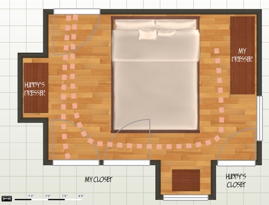
Our bedroom has had the same furniture layout since we moved into our home in 2006. The bed and the large mirrored dresser (which I use) were placed in the only locations that they seemed able to fit. The bedroom has a tricky floorplan with three closet doors, a dormer, a wall with a window, and a wall with a nook. There is only one relatively uninterrupted wall. The overall dimensions are 12′-5″ x 8′-8″. My husband and I loved the smallness of it at first–it was ours, not a rented apartment, and it felt like a cozy little cocoon. But eventually the layout was just frustrating! The furniture felt less arranged than packed wherever it could fit. Take a look:

The pink dots represent the paths I would need to take to access my dresser and my closet. You can see from the door swing that one of my closet doors could only open a bit before bumping into the bed–there was only 16 inches of space between the wall and the foot of the bed. It wasn’t much easier accessing the dresser drawers with little space between the dresser and the bed. What a pain!
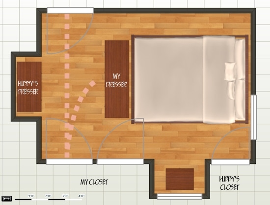
I had often thought that “if only” that pesky window wasn’t on the shorter wall, I could put the bed over there instead. But then what would I do with the large mirrored dresser? It wouldn’t fit next to the bed. I supposed I could get rid of it if I really wanted to, but I hated to break up the bedroom set. I got out my measuring tape and decided that if the dimensions would otherwise work out, I would move the bed, then figure out later how to deal with the window and the dresser. Here’s what I came up with:

My husband was a bit doubtful at first, but after I explained the plan he was excited to give it a try and he helped me move everything last weekend. The mirror on my dresser was removable, so we took it out, and moved the dresser to the foot of the bed. I don’t miss the mirror. Though you would think a nice large mirror is just the thing to make a small room seem larger, I found that instead it highlighted all of the furniture packed into our little space, and made it seem doubly packed. With the new layout, there is a space of 16 inches between the wall and the left side of the bed, a bit tight, perhaps, but plenty of space for me to access my side. On the other side of the bed where the closet doors open up, I was able to snag a few more inches, making a total clearance of 24 inches compared to the 16 I had before! My closet door can open a lot wider, making it so much easier to access, and my husband’s closet door still opens up all the way.
You can see from the new path that all of my clothing is centrally located, making it a lot more convenient to pick out and put away. My husband still has a bit of a hike from his dresser to his closet, but he’s more naturally neat than I, so it isn’t a problem for him. Overall, the room feels much larger, because we can view the full length of the room from bed rather than a wall nearly at our feet.
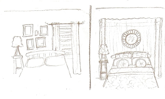
Now what about that pesky window? An asymmetrical wall behind a bed is definitely not the ideal situation. I sketched up a couple possible solutions to deal with this.

1) Use a grouping of framed photographs to balance out the window
or
2) Install curtains over the majority of the wall, creating an illusion of symmetry
My husband and I have already decided on the solution we like best, and I have set to work doing some minor redecorating which I will share with you as soon as everything is in place. Which would you pick?

so funny, our bedroom is nearly the exact same layout, small and no real wall space. There’s 2 windows, a double closet, single closet, door to the bathroom and door to the hallway, all in a tiny space. For the longest time we had the bed in one location, and finally moved it in the same way as this to gain more space. We ended up moving both dressers to kid bedroom and the other to the finished basement for craft/school storage and purchased a relatively large dresser to work for the both of us… But we still have a weird symmetry going on behind our bed, since it covers up a small part of the window. I’ve contemplated going the large drapes route but in the end decided that I don’t want that much dust collection going on so close to our bed…also we have tall baseboard radiators. So I think we’re going to go with the frames solution. I was also thinking of just using some fabric covered frames to bring something interesting into the room. I hope to finish that project once I make the headboard I’m envisioning… Ah, so many projects, so little time. Can’t wait to see what you come up with!
That’s so funny that we’re dealing with the same kind of situation. I thought my room was rather unique in its awkwardness. I’ll try to dig up a few example pictures for my next post.
Ooh, I would choose the one on the left. Your sketch makes me think of a Parisian appartment.
Also, I guess that look would be less expensive, especially if you are keeping the existing curtains on the window. It would be expensive to install new, large curtains, rather than a few pictures.
I like that you mention “Parisian”, because that’s kind of the theme I’ve been going with for a long time. My bedside lamps are models of the Eiffel Tower, and I have some pictures of Paris for the wall. Can’t wait to share some photos! Thanks for stopping by!