The tiny bathroom downstairs was definitely a perk when we moved into our current home, after making do with just one bathroom in our old house. It really wasn’t much of a bathroom at all, though–just a toilet tucked into a sloped-ceiling closet beneath the stairs. It was dark, it was dingy, it had no sink.
I was thrilled to solve the sink problem some time ago with an ingenious product called SinkPositive. I had been itching to give the tiny room a full makeover and finally tackled the project last month. It’s amazing how much work and tedium a 3 foot by 5 foot room can entail, but I am so happy with the end result.
Tiny Bathroom Before
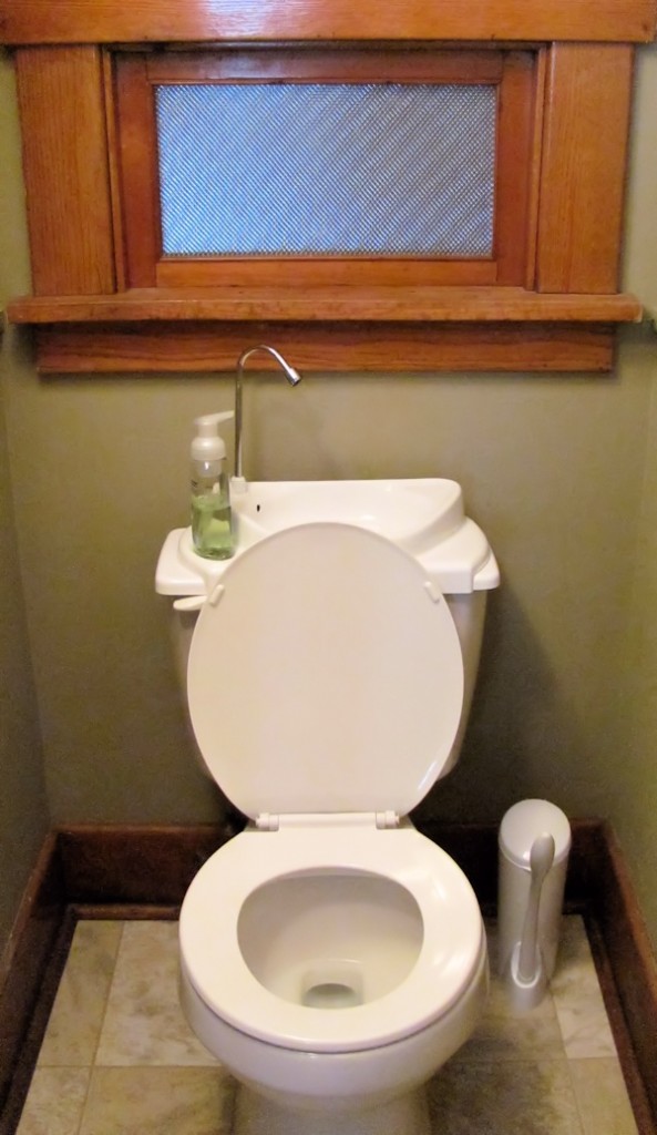
Before, the room had the original oak trim which was nice, but could never convince me of its cleanness. It was painted in neutral gray-green that was much too dark for the room, which only has one small window looking out onto our kitchen foyer.
The only source of light other than that window, an ugly old medicine cabinet mounted on one of the walls and infringing on the already tight space.
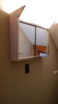
My goal with the redesign was first to brighten up the space a whole lot. I also wanted to make the room feel as spacious as possible by eliminating clutter on the walls. The scale of the basic faux tile sheet vinyl floor was too big for the space, and the lines drew attention to the fact that the walls were not quite square.
I wanted to remain faithful to the home’s historic look and feel (a Craftsman built in 1918), without being a slave to it…so I committed the cardinal sin of old home ownership and painted that dark wood.
Tiny Bathroom After
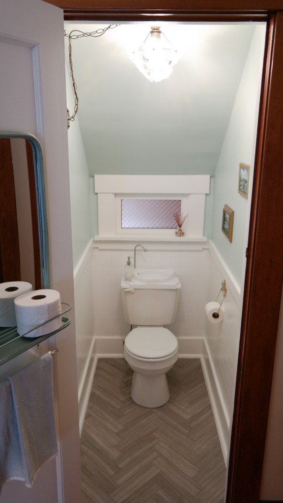
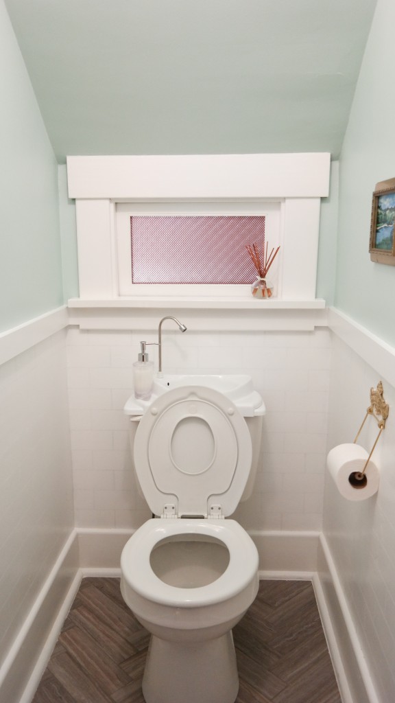
I’ll just cut to the chase and show you the “after” photos, and then go into some detail about the work involved.
DIY Bathroom Remodel
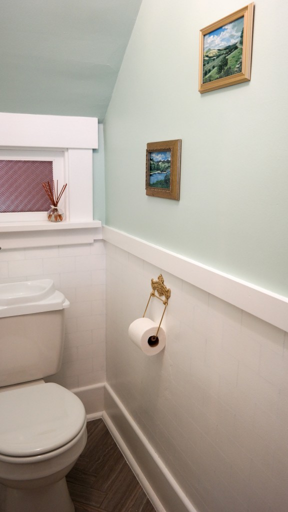
The lighter paint colors made a huge difference right away. The room receives a minimal amount of light, but now it has a chance to reflect off of bright surfaces. For the upper walls and ceiling I used Olympic ONE in “Morning Breeze” eggshell. I decided to paint the sloped ceiling the same color as the walls because there was just so much going on in the bathroom and I wanted to simplify it a bit. I think it worked wonderfully. I painted the wood trim with Valspar Signature Paint + Primer in Ultra White satin. It will be easier to clean the woodwork now.
We added some molding to the side walls to create some separation, then I added faux subway tile using two different paint sheens: Valspar Signature Ultra White in flat and Valspar High Gloss Enamel Ultra White. First, I painted the entire lower half with the flat paint. Once it was dry, I used a level, ruler and pencil to create 3 inch x 6 inch tiles. I purchased 1/8″ painters tape from Amazon and applied it along my pencil lines.
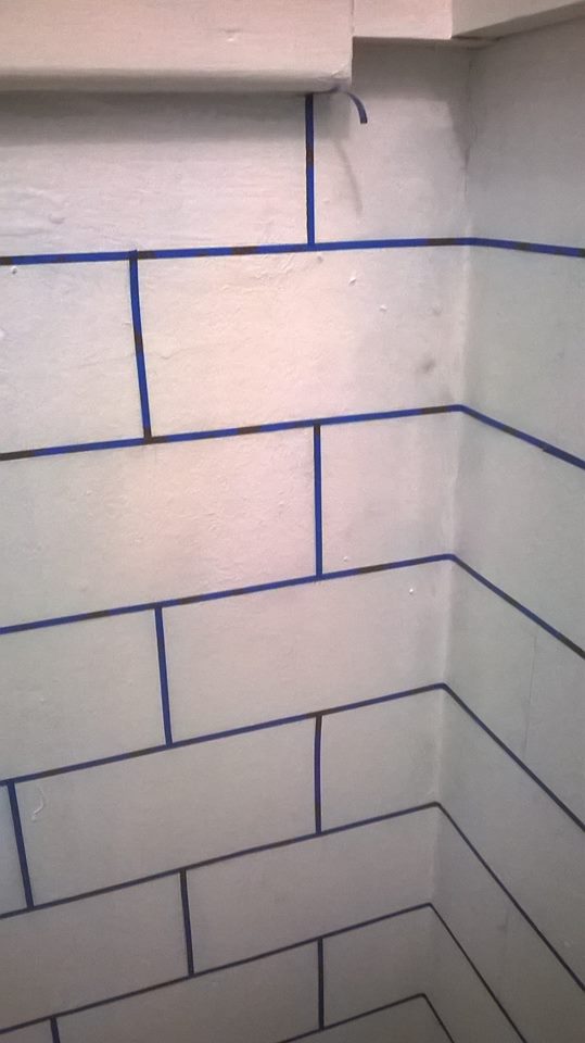
I rolled on two coats of high gloss enamel, then removed the tape. This lends a very subtle effect that I’m happy with.
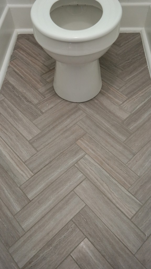
The existing sheet vinyl floor was neutral and relatively inoffensive, but its tile grid pattern was too large for the room. I wanted something that looked more historic. At Lowes I found wonderful vinyl peel and stick tiles that look highly realistic and are groutable. They were very inexpensive, too, at just $1.28 per square foot. The tiles started out measuring 6 inches x 24 inches, but I cut them down into four pieces because I wanted a smaller scale for the room. Cutting them is very easy: score with a utility knife and then snap along the line.
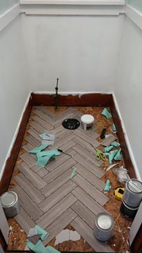
I found that the adhesive wasn’t quite strong enough to keep the tiles from shifting (and I’m sure the existing subfloor was partly to blame), but once grouted, they were locked into place and I’m confident the floor will hold up to wear. It looks like a real tile floor and I couldn’t be more pleased (especially since this was my first time installing and grouting tile of any kind).
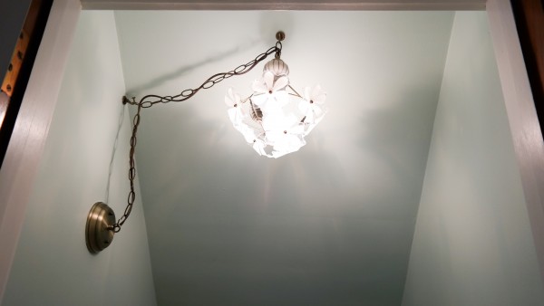
Once we removed the ugly old vanity, there was no light source in the room. Rather than attempt to add wiring for a ceiling light (we’re dealing with a space under the stairs), I decided to use the existing wiring and “swag” a hanging light fixture, suspending it from a hook on the ceiling. I found a suitable light fixture from Home Depot that was inexpensive to begin with with, but I checked eBay and found the same fixture for just $14 shipped!
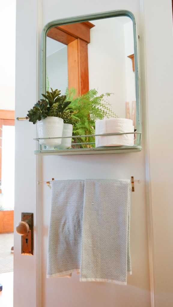
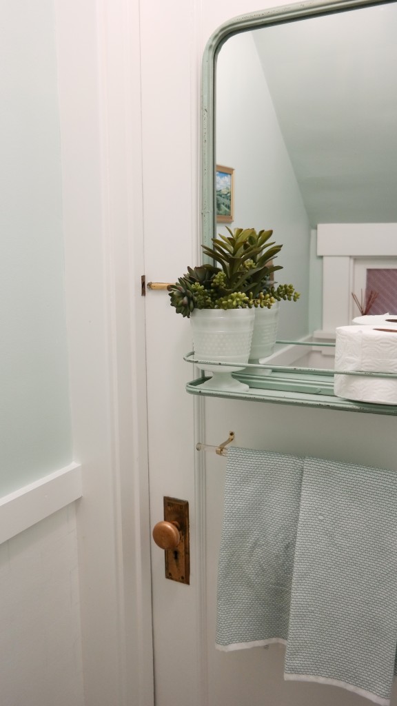
To replace the old medicine cabinet, I found a mirror on the World Market website inspired by an antique French design. The attached shelf provides much-needed storage space for extra toilet paper. I mounted the mirror to the door to save wall space. Faux succulents in a piece from my milk glass collection add a bit of greenery. I discovered the beautiful glass towel rod in our basement!
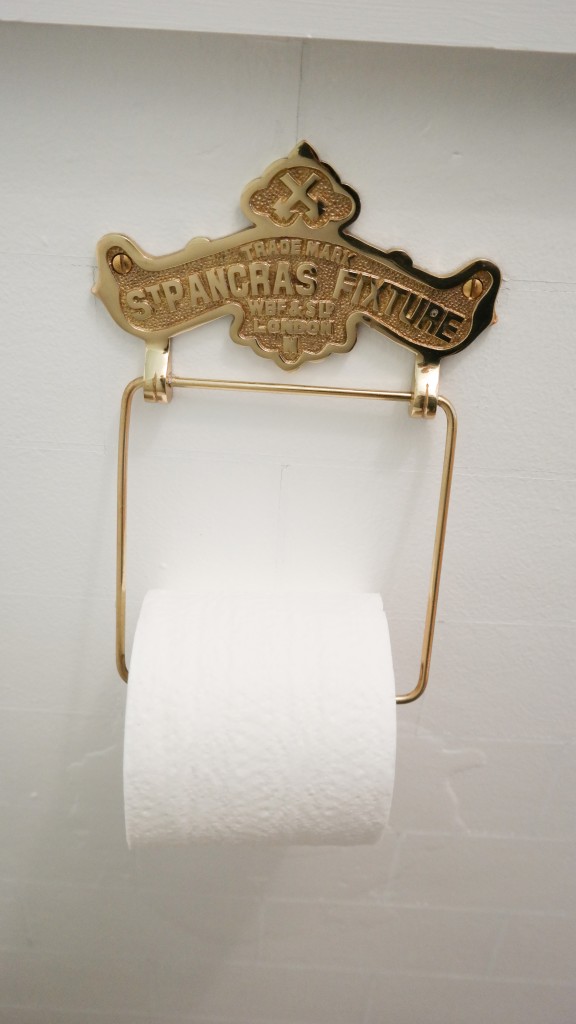
For finishing touches, I found an antique reproduction brass toilet paper roll holder that references my husband’s home country…
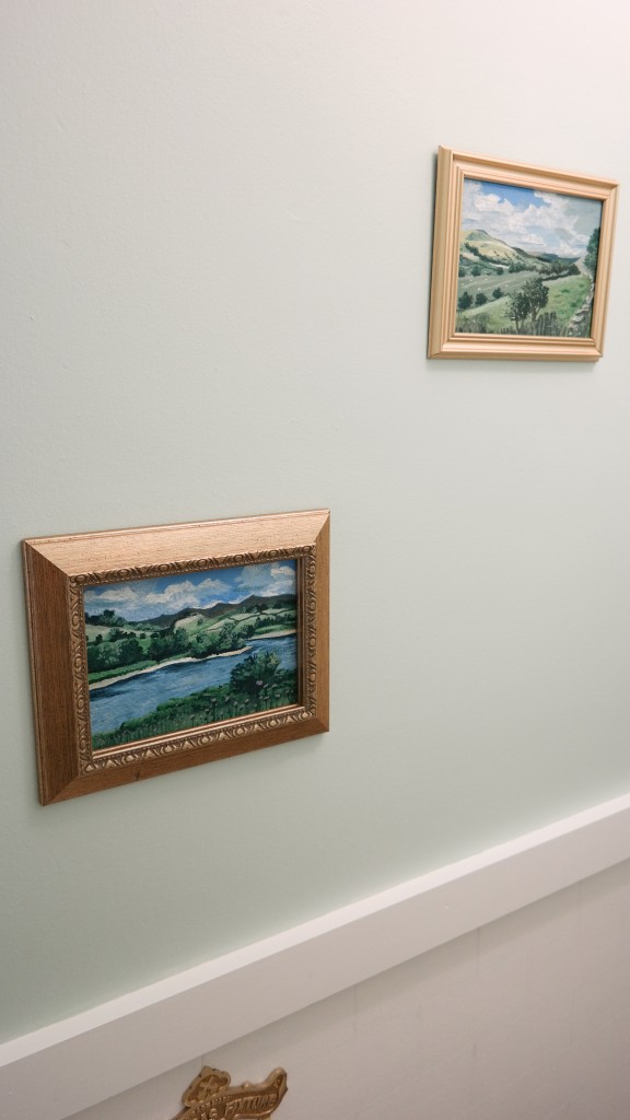
…and I painted two little 5 x 7 landscapes from photographs of our trip to England last summer.
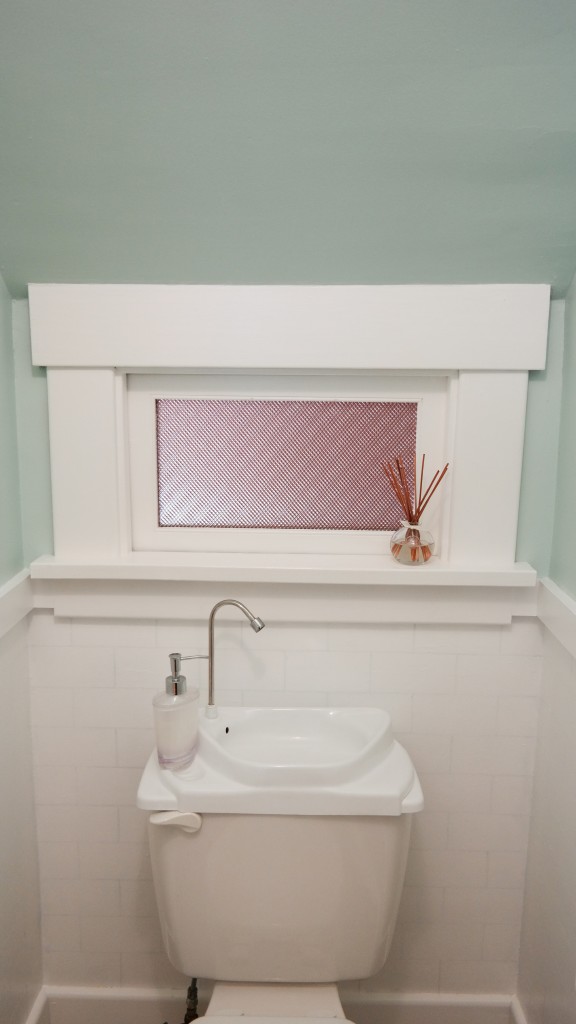
A reed diffuser from the Yankee Candle Simply Home collection at Kohl’s freshens the room up. I absolutely love the clean, powdery White Linen and Lace fragrance.
Fun Fact: The window had some nice decorative privacy glass that I accidentally smashed one day. I replaced it with two layers of a fluorescent light diffuser (bumpy sides sandwiched together). It has worked great!
What a huge difference just a few simple changes made for this tiny bathroom! It feels brighter, cleaner, more spacious, and much more suitable for guests. Now it’s a little jewel of a room instead of a gloomy under-stair cave. Now to brainstorm my next project…

Super cute! I. Love it and I’ve never seen a potty sink before!
Thanks, Renee! That sink has become quite the conversation piece in our house 😀
Great job on the after – I just love that color of blue. It really makes the bathroom seem bigger. The gold leaf framed art is also a very nice touch :-).
I didn’t even notice the potty sink at first – very cool.
Thanks Derek! It’s one of my favorite colors.
Jen, I’m really impressed with this makeover. Good brainstorming, great use of space! Found a link to you on WorldMarket.com under the mirror (too bad it’s no longer available online). I’m glad you linked it. Cheers~
Thank you, Kerry! I hope they restock the mirror. It’s such a great piece.
I love the faux subway tile. Very ingenious!
Thank you!
Amazing guide! It really helped me to increase space in my bathroom and fix toilet positions problem. Thanks Jennifer
I love your herringbone floor. I’m thinking of doing something similar to a small entryway. Do you recall what size you cut the tiles down to in order to work in that smaller space?